
Numbers used to be the side dish of sports. Box scores in the newspaper, a few averages, maybe a percentage or two — that was it. In 2026, though, advanced stats are the main course. If you want to really know how strong a team is, you don’t just look at wins and losses; you dig into the math that lives “behind the numbers” and shows you what’s actually driving those results.
Below is a practical, step‑by‑step guide to using advanced metrics to uncover a team’s true strength, with a bit of historical context so you see how we got here — and how not to get lost in the data.
—
How We Got from Box Scores to Big Data
For decades, coaches judged teams by feel: “They play hard, they rebound, they defend.” The stats mostly just confirmed the story you already believed. That started to crack in baseball with Bill James and sabermetrics in the late 1970s and 80s, when people realized traditional stats like batting average hid more than they revealed.
By the early 2000s, the Moneyball era proved something important: you could systematically find undervalued skills with numbers that nobody else was using. Basketball followed with lineup efficiency and shot‑chart analytics; soccer and American football joined in as tracking technology took off. Today, when people search for advanced basketball stats explained, they’re often trying to understand concepts that NBA front offices have relied on for more than a decade.
—
What “True Strength” of a Team Actually Means
Before you fire up any dashboards, you need clarity on what you’re chasing. “True strength” isn’t just who won last night. It’s how good a team is once you strip away luck, small‑sample noise, and weird context like garbage time.
In practical terms, we’re usually trying to estimate how a team would perform:
– Against an average opponent
– On a neutral field or court
– Over a long stretch of games rather than a hot or cold week
That’s why modern team models care so much about possession‑based stats, shot quality, and play‑by‑play data. They’re not asking, “Did this team win?” but rather, “How often did they create winning conditions?”
—
Necessary Tools: What You Actually Need in 2026

The good news: you don’t need a PhD or a cluster of servers to get started anymore. You do, however, need more than a box score and a hunch.
At minimum, you’ll want three kinds of sports analytics tools for team performance analysis:
1. Data source
Public league APIs, tracking‑data providers, or an advanced team stats subscription service that gives you play‑by‑play, possession‑level, or event‑level data, not just final scores.
2. Analysis environment
– Spreadsheet software (Excel, Google Sheets) if you’re starting simple
– Or a scripting environment (Python, R) once you want repeatable workflows and models
3. Visualization platform
Could be built‑in chart tools, Power BI, or open‑source libraries like Matplotlib or Plotly to turn columns of numbers into something you can actually interpret.
If you’re working inside a club or organization and need more than public dashboards, this is where you might decide to buy sports data analytics software for teams that bundles all of this into a single platform with support, storage, and security built in.
—
Core Ideas Behind Advanced Team Metrics
The labels vary by sport, but under the hood, the logic is surprisingly similar across games.
You’ll see this clearly if you compare the best advanced football statistics to analyze team performance in soccer or American football with what’s popular in basketball. In all three, the key questions are: How efficiently do you turn opportunities into points? How well do you limit your opponents’ opportunities? And how repeatable are those patterns?
Let’s run through the recurring themes that show up everywhere, regardless of the ball shape.
—
Efficiency Over Totals
Totals are seductive: total yards, total points, total shots. But they mostly tell you who had the ball more, not who was better.
Efficiency flips the script by asking, “What did you do per unit of opportunity?”
– In basketball, offensive and defensive rating look at points per 100 possessions instead of per game.
– In soccer, expected goals (xG) and expected goals against (xGA) adjust for shot quality, not just shot count.
– In American football, expected points added (EPA) per play weighs every snap by how much it changes the likelihood of scoring.
Teams that win the efficiency battle consistently tend to be truly strong, even if their raw totals bounce around from game to game.
—
Context Adjustment: Opponents, Pace, and Game State
A 24‑point win against the worst team in the league is not the same signal as a 3‑point win on the road against a contender. Serious advanced stats adjust for that context.
Modern models consider who you played, where you played, and what the game state was. Garbage‑time minutes, desperation heaves, and end‑of‑game fouling can warp raw numbers. The stronger metrics either strip those out or explicitly model them so you don’t overreact to noise.
—
Step‑By‑Step Process: From Raw Data to Real Insight
Let’s walk through a practical workflow you can reuse, whether you’re doing a school project or building a report for a professional staff.
1. Define the question
Are you trying to rate a team’s overall strength, evaluate a recent slump, or compare two tactical styles? Narrow the goal; it will guide which stats you actually need.
2. Collect the right data
Use your chosen provider or advanced team stats subscription service to pull:
– Game‑level results and opponents
– Play‑by‑play or event‑level logs if available
– Lineup, formation, or personnel data for deeper context
3. Clean and standardize
Fix missing values, unify naming conventions, and filter out non‑competitive minutes (like junk‑time possessions), if your sport has them. This step isn’t glamorous, but skipping it will wreck everything that comes after.
4. Build possession or play‑based measures
Calculate stats per possession, per play, or per shot, depending on the sport. This normalizes for pace and volume so you can compare slow, methodical teams with up‑tempo ones on equal footing.
5. Layer in opponent and context adjustments
Apply strength‑of‑schedule factors, home/away effects, and game‑state filters. This can be a simple weighting scheme or a more advanced regression model.
6. Visualize trends, not just snapshots
Plot rolling averages (say, last 5 or 10 games) for key metrics. You’re looking for inflection points: when did offense start improving, or defense begin to leak?
7. Translate numbers into decisions
The end product isn’t a fancy chart; it’s a concrete takeaway: shift tactics, alter lineups, tweak training focus, or reset expectations. If the analysis doesn’t lead to a decision, you probably over‑complicated it.
—
Basketball Example: Seeing Beyond the Scoreboard
If you’ve ever wondered why people are desperate to get advanced basketball stats explained in plain language, it usually comes down to reconciling a paradox: a team with a mediocre record can still be genuinely good.
Imagine a team that’s 18–18 but has blown out weak opponents and lost close to elite ones. Their net rating (point differential per 100 possessions) might be top‑10 in the league. They’ve run into bad late‑game luck, but possession‑by‑possession they’re dominating.
Now flip it: a 24–12 team with a slightly negative net rating, buoyed by a lot of narrow escapes against soft schedules. The record looks fantastic; the underlying strength is shaky.
Advanced stats force you to ask: Which of these two do I actually trust when the playoffs start?
—
Football Example: What Really Drives Team Performance
Football (both American and global) was slower to accept analytics because the game states are messy and events are fewer. But by the mid‑2020s, coaches and analysts had converged on a core toolkit.
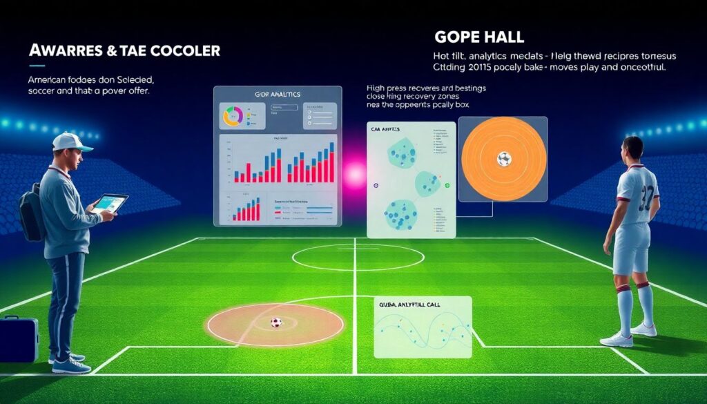
In soccer, xG, field tilt, and high‑press recoveries near the opponent’s box help explain pressure and chance quality better than simple shot counts. In American football, the best advanced football statistics to analyze team performance are usually EPA per play, success rate, and early‑down efficiency, all adjusted for opponent and situation.
Both codes now lean heavily on route maps, pressure heat‑maps, and tracking data to see not just what happened, but what should have happened given the quality of chances and decisions.
—
Choosing Software and Data Services Wisely
The market in 2026 is crowded. Before you sign anything, be very specific about what you want your tools to do.
If you’re considering whether to buy sports data analytics software for teams, test three things:
– Data depth – Do you get tracking and event data or just summaries?
– Customizability – Can you build your own metrics and filters, or are you stuck with whatever the vendor thinks is important?
– Workflow integration – Will your coaching staff actually use the interface, or will this live and die in the analytics office?
Sometimes a lighter setup — a reliable data feed plus Python or R — beats a heavyweight platform if you have the technical skills in‑house.
—
Reading and Presenting Results Without Losing People
You can have the best model in the world and still fail if nobody understands you. Modern analytics is as much about storytelling as it is about math.
Translate the numbers into language that connects: “We allow 6 more expected points per game when this lineup is on the floor,” or “Our shot quality has improved even though we’ve lost three in a row.” The goal is not to show off complexity; it’s to bridge the gap between what the data says and what coaches and players feel on the field.
—
Troubleshooting: Common Pitfalls and How to Avoid Them
Working with advanced stats is a bit like adjusting a telescope. You can see incredible detail, but a small misalignment throws everything off. Here’s where things usually go wrong — and how to fix them.
1. Overreacting to small samples
A hot week doesn’t mean a permanent leap. Check how many possessions, plays, or shots you’re basing your conclusion on. If the sample is tiny, treat the result as a hint, not a verdict.
2. Ignoring context
If your model says the defense collapsed, but three of the last four games were against top‑tier offenses, re‑run the numbers with opponent adjustment turned on. Context‑free stats can be wildly misleading.
3. Metric overload
When you’re tracking 40 different stats, you’re effectively tracking none. Prioritize a small set that directly links to your team’s playing style and goals, and let the rest sit in the background.
4. Confusing correlation with causation
Just because two numbers move together doesn’t mean one causes the other. It might be tactics, injuries, or opponent quality driving both. Use film, coaching input, and domain knowledge to sanity‑check what the model is suggesting.
5. Poor communication of uncertainty
No stat is a guarantee. Show ranges, not just point estimates, especially when dealing with projections. Saying “We project 52–56 expected points over a season” is more honest — and more useful — than pretending you know the exact number.
—
Bringing It All Together in 2026 and Beyond
Advanced stats no longer live only in pro front offices. High‑school programs, amateur clubs, and even fan communities now have access to data and tools that would’ve looked futuristic 15 years ago. The frontier in 2026 isn’t just “more data”; it’s better questions, cleaner workflows, and clearer communication.
If you understand the history, pick the right tools, follow a disciplined process, and keep an eye out for the usual stumbling blocks, the numbers stop being intimidating and start becoming a competitive edge. That’s when you’re truly seeing behind the numbers — and into the real strength of any team you’re analyzing.